NEXTEND
2020-02-21
#Development
#Research
#Design
#Motion Design
The client NEXT Festival is a theater, dance en performance festival in the Eurometropool. This is a region that spans over a part of Flanders, Wallonië and France.
> team
Ayko De Smedt - Head Designer Simon Hanselaer - Head Programmer Eva Denys - Head Researcher, Motion designer
> tools
ReactJS, Firebase, Figma

> the brief
For our bachelor's thesis we were asked to solve the problem of our client, using our skills. First we would need to research everything of the client and their problem, then come up with a solution that fits best. This solution should be worked out with our development and design skills. The problem The people who go to NEXT Festival, stay within their own district. NEXT Festival wants to make sure that people also go to the festival outside of their ow district. They also want that more people know what the Eurometropool is and what they do.

> the solution
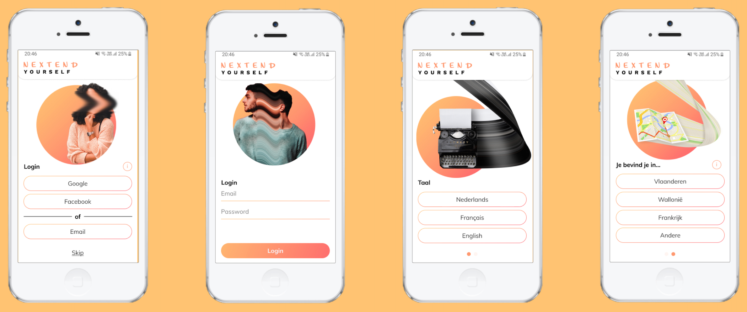
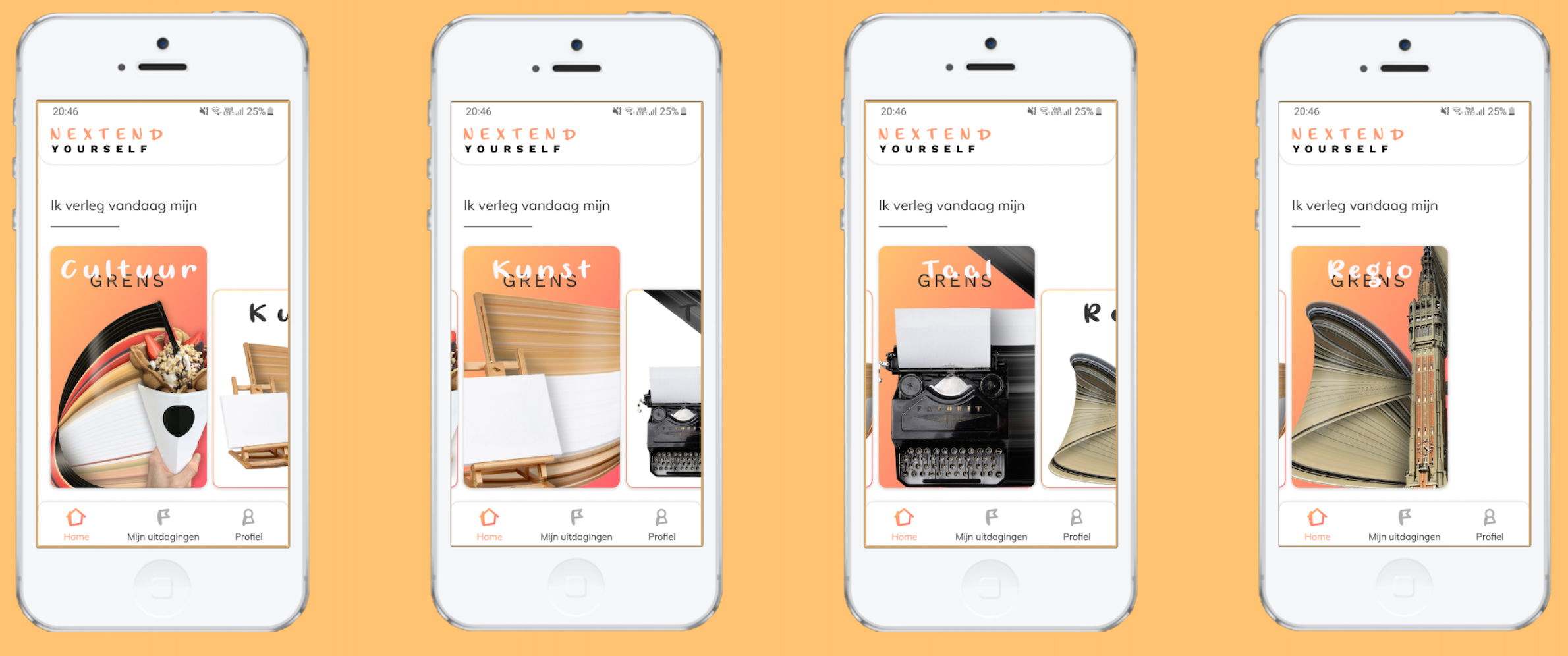
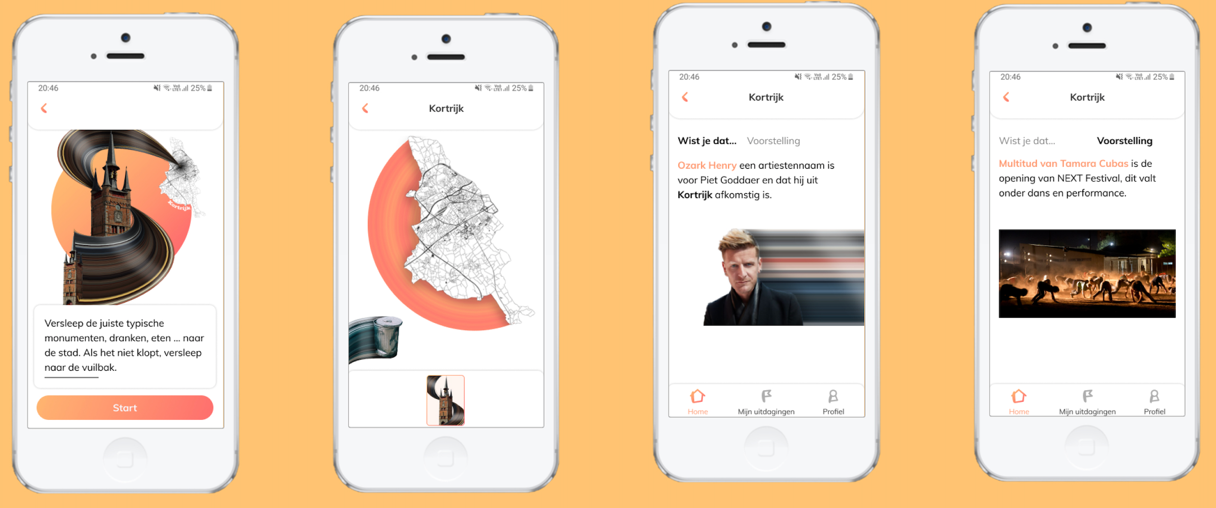
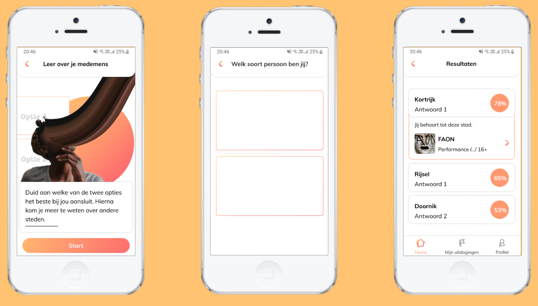
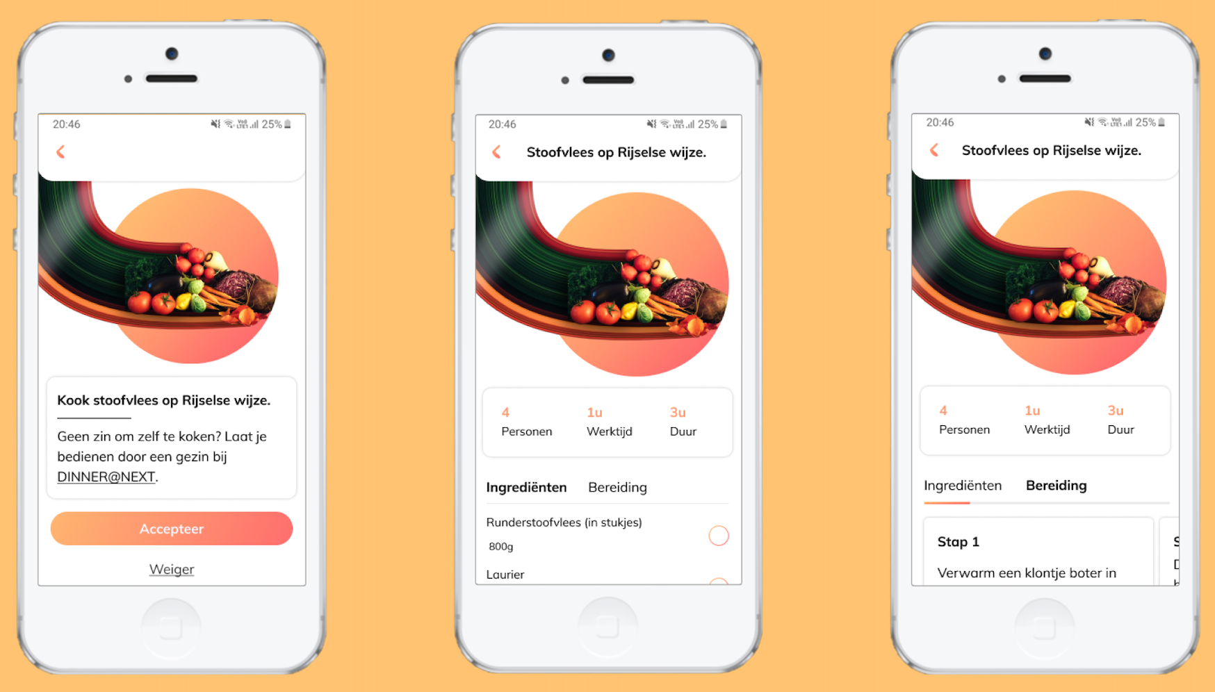
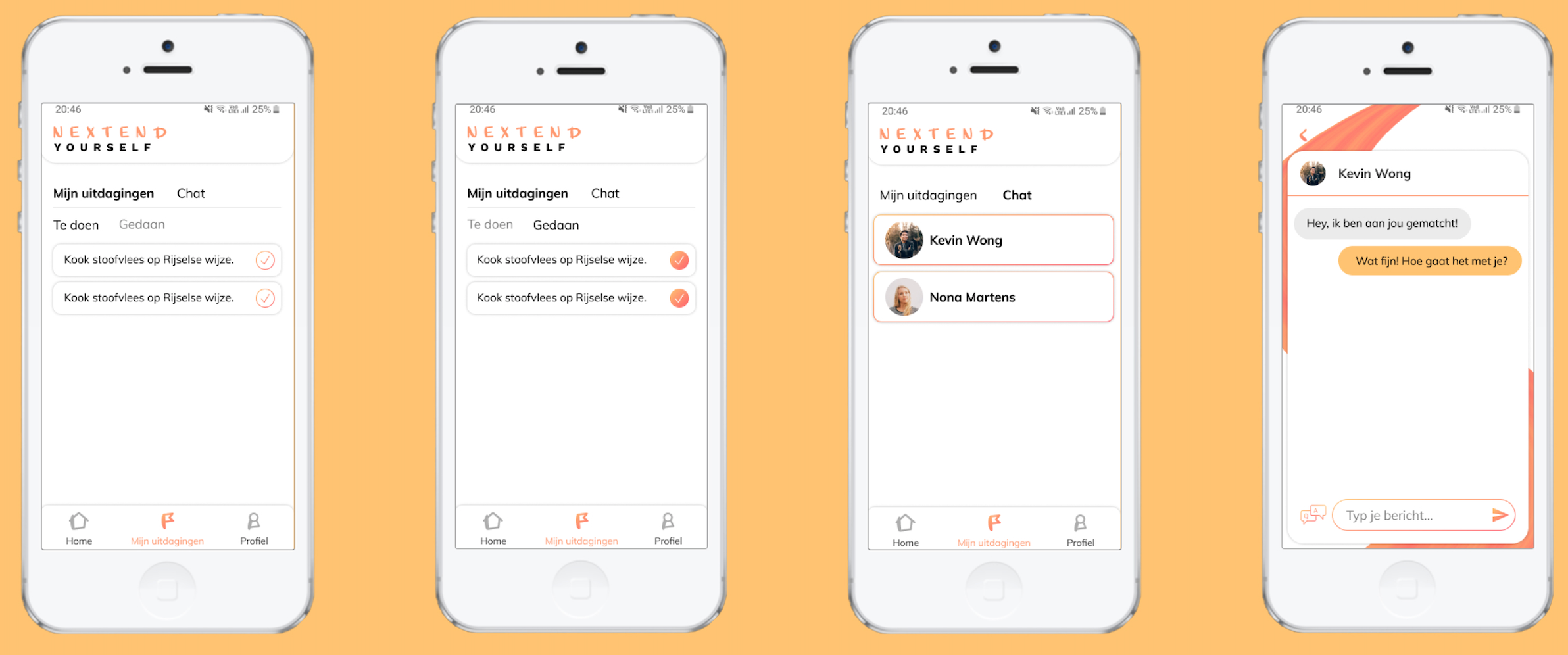
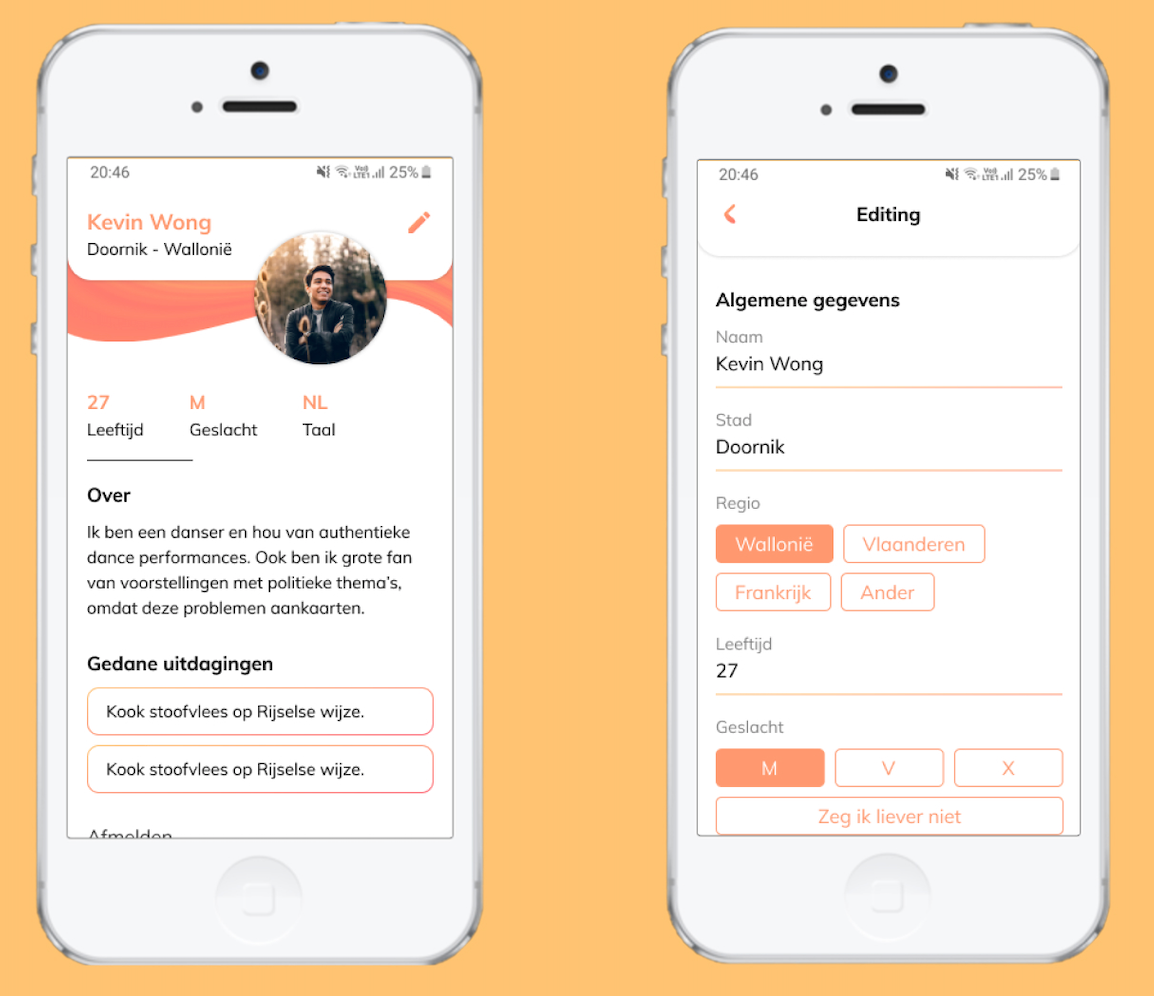
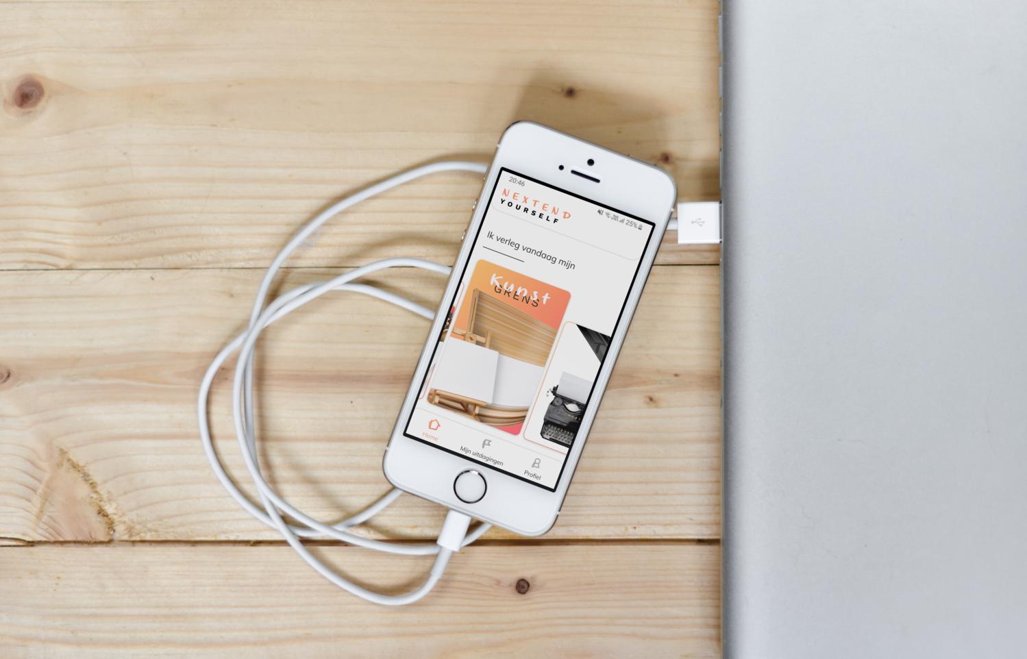
Goal audience The core user group of our project is people who are interested in art. For example, people that like to go to a museum, that are busy with fashion or music, ... This user group can know NEXT Festival and maybe even have been to the festival, but that is not necessary. Offline campaign Posters will hang on locations where our user group hangs out. They are found in places like an art academy, the libary, music school, some theaters. These people will be triggered by these posters, to surf to our web application and take on the challenge with themselves. Online campaign The online campaign will be brought on social media. Our persona (Livia) sees an Instagram banner and is able to come on our web application with only one single click. She is intrigued by the idea of literally extending herself and her limits. Design Colors Our color palet is chosen because of the psychology behind them. Orange is a warm color, that activates, but also emits creativity and impulsivity. From research, we know that creativity and impulsivity are a big quality of our user group. Because of this, it is the perfect color for Nextend. Fonts The fonts are chosen on a basis of characteristics of our user group, but also for the chosen device. The detail font emits creativity and impulsivity. The main font is a sans-serif font, because of the good readabilty on a mobile device. Icons The icons are based of the font ‘Living Selflessly’. This because of the feeling of creativity and impulsivity that is passed onto the icons. To see the whole design look at the included images.
